UX/UI Design & Research
Mell.ro: from sign-up to signed contract
Mell.ro is a Brazilian proptech/fintech (founded in Curitiba) focused on financial and operational solutions for the rental housing market. It mainly acts as a rent payment guarantor, connecting owners, independent agents and tenants. Its central goal is to remove the bureaucracy of traditional renting (such as requiring a guarantor or a heavy deposit) and shield the lessor from default.
Property registration and listing flow plus guarantee plan selection, designed for low friction and maximum conversion.
01/3
- Project
- Product design challenge
- Platform
- Web (desktop)
- Scope
- Flow, screens and design system
- Delivery
- 15 screens and states
01 · The challenge
Finding out what the MVP needs to ask
The challenge came with no ready screens, wireframes or field list. The mission was to design the full two-stage flow and decide which information a working MVP really needs.
Registration and listing
The client (agent or owner) enters the property details, sets values and, if there’s no tenant yet, publishes the listing to generate leads.
Guarantee plan
At checkout, they set the pricing model with the Mell.ro fee and see transparently what each party receives.
Deliverables
Flow map, handoff with high-fidelity screens and states, and a component page with Auto Layout and variants.
Criteria
Flow clarity, Figma organization, field choices, UX decisions, scalability and handoff readiness.
02 · Flow map
The user journey, end to end
After logging in, the user chooses to list or calculate. Both paths use the same questions and meet at the plan choice.
03 · Screens and UX logic
Every screen, and why it works that way
Browse with the list, the arrows or the ← and → keys. Click the screen to view it full size.
Entry · 01/15
Opening
Logo and a single link, “Start”. No menu and no distractions: the user’s first decision is to come in.
Interaction
Interactive prototype
Open in Figma04 · UX principles
Decisions repeated across the flow
Ask little, early
Registration has four fields. Data that changes the calculation, like condo fee and property tax, only comes later.
Never leave the user lost
Breadcrumb on every step, an always-visible Back button and an editable property chip.
Price transparency
Plans show side by side what the owner receives, the tenant cost and the fee.
Flexible entry
“Calculate” delivers value without requiring a listing or contract, and leads to the same guarantee plan.
The right control for each input
Radio for profile, stepper for rooms, select for dates and toggle for yes or no.
Visible states
Waiting for server, pending, signed and validated: the user always knows where they stand.
05 · Documentation
Everything created for the project
Flow map
Flowchart with both paths (list and calculate), decisions, data processing and financial simulation.
High-fidelity screens
15 screens and states: login, choice, registration, specs, photos, review, calculation, plans, fee, contract and confirmation.
Design System: foundations
A document explaining the system’s purpose: reusable components with variants, states and usage rules, a reference for designers and developers, favoring existing components before creating new ones.
Component page
Inputs, primary button and text button, with Auto Layout and variants, as the challenge requested.
Handoff notes
Rules Inspect doesn’t show: overflow, error messages and field behavior.
Benchmark and AS IS
Analysis of competitors (5andar, Loft) and Mell.ro’s current flow.
Components used in the screens
- Primary button (white pill)
- Secondary “Back” button
- “Choose” text button
- Text input
- Number stepper
- Radio
- Select
- Yes/no toggle
- Breadcrumb
- Property summary chip
- Plan card
- Rent/Sell toggle
- Value range
- Status message
- Upload area
- Person card with status
Visual foundation
Brand blue
#339AF0
Action blue
#0F62FE
Deep blue
#00308F
Success green
#279A7D
White
#FFFFFF
Approximate colors, read from the screens. Typography: Roboto.
06 · Results
A more practical, faster flow
The project’s results show in the experience as a whole and in each step of the interface.
The project was evaluated with a SUM test, a test that measures users’ effectiveness, efficiency and satisfaction. It combines each task’s completion rate (effectiveness), the comparison between achieved time and goal time (efficiency), and satisfaction collected through the normalized SEQ, resulting in a single usability reading for each step of the flow.
| Task | Completion rate (Effectiveness) | Standard time / Goal (T₀) | Average time achieved (T̄) | Satisfaction (normalized SEQ) |
|---|---|---|---|---|
| T1: Filter & Selection | 95,0% | 150 s | 105 s | 88,0% |
| T2: Proposal Simulation | 92,0% | 180 s | 120 s | 84,0% |
| T3: Registration & Guarantee | 86,0% | 280 s | 205 s | 72,0% |
| T4: Review & Signature | 90,0% | 153 s | 90 s | 82,0% |
| Weighted Average / Total | 90,75% | 763 s (Total) | 520 s (Total) | 81,50% |
Results mapped across the interface
Entry
Path set from the start
Anyone who only wants a rent estimate can calculate without listing. Each person goes straight to what they came for.
Registration
Fewer fields, less effort
Only four inputs at the start. Users move fast and track progress through the breadcrumb.
Specifications
Less typing, fewer errors
Steppers, selects, radios and toggles replace free text fields wherever the data allows.
Photos and review
Listings start with quality
The 3-photo minimum and a clear waiting state show users what’s missing and that the system is working.
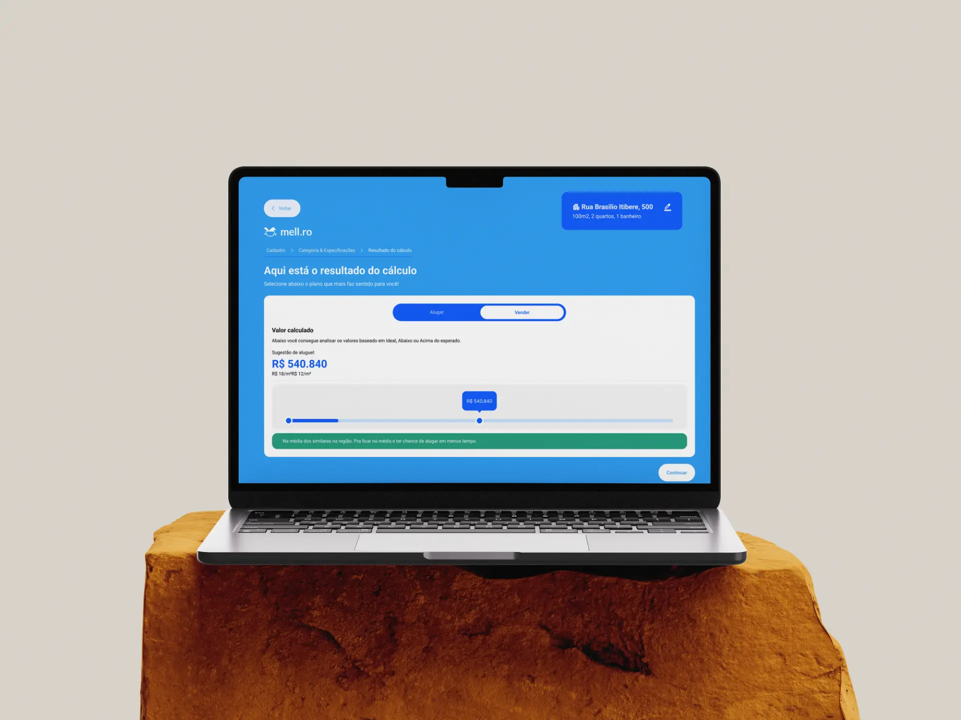
Calculation
Value before commitment
Users get a suggested price, with a reference range and local context, before deciding anything.
Guarantee plan
Decide without switching screens
The three plans sit side by side, with payout, cost and fee visible. Easy to compare and choose with confidence.
Contract
Progress always visible
Per-person status (pending, signed, validated) and a fixed document summary prevent doubts and back-and-forth.
07 · Learnings
What this project taught me
Ask only what changes the decision
Every field must earn its place. Non-urgent data can wait and come in when it makes sense.
One flow, many paths
Reusing the same questions to list and calculate reduced rework and made the system simpler to maintain.
Transparency builds trust
Showing side by side what each party receives and pays makes choosing a plan easier and reduces objections.
States are design too
Waiting, pending, signed and validated are part of the experience. Designing them early avoids empty screens and doubts.
A design system speeds everything up
Reusable components with variants and states kept screens consistent and paved the way for handoff.
Document for the tech team
Flow, components and rules Inspect doesn’t show must be documented so development stays predictable.
Next steps
- Validate the flow through usability tests with owners, agents and tenants.
- Track completion and drop-off metrics per step.
- Complete the component page and handoff notes.
More projects