Brand & Visual Design
The Ripen
Visual identity for Ripen, an information management holding that builds software focused on security and credibility.
- Client
- Ripen
- Scope
- Brand Design
- Year
- 2023
- Tools
- Illustrator · Photoshop · Figma
01 · About the project
An information holding, built on trust.
Ripen is a company in the process of creation. The proposal is to be a ‘holding’ of information management in its own system, where its customers have specific tools for their needs.
The company intends to work in software development, seeking security and credibility in its deliveries.
02 · Moodboard
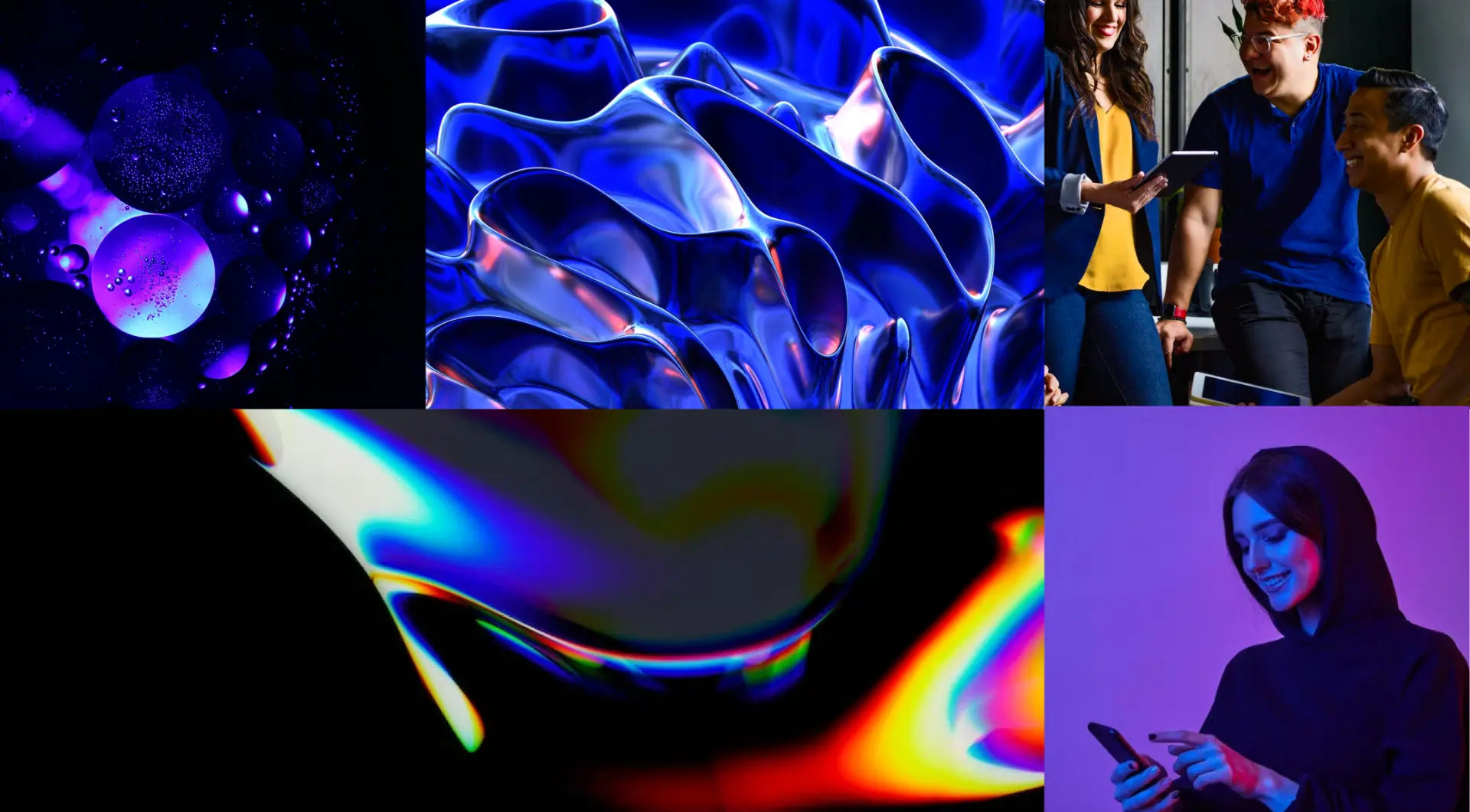
Technology, fluidity and people.
Liquid shapes, iridescent light and violet tones set the brand’s atmosphere — balanced with images of connected people, reinforcing the human side of technology.
03 · Concept
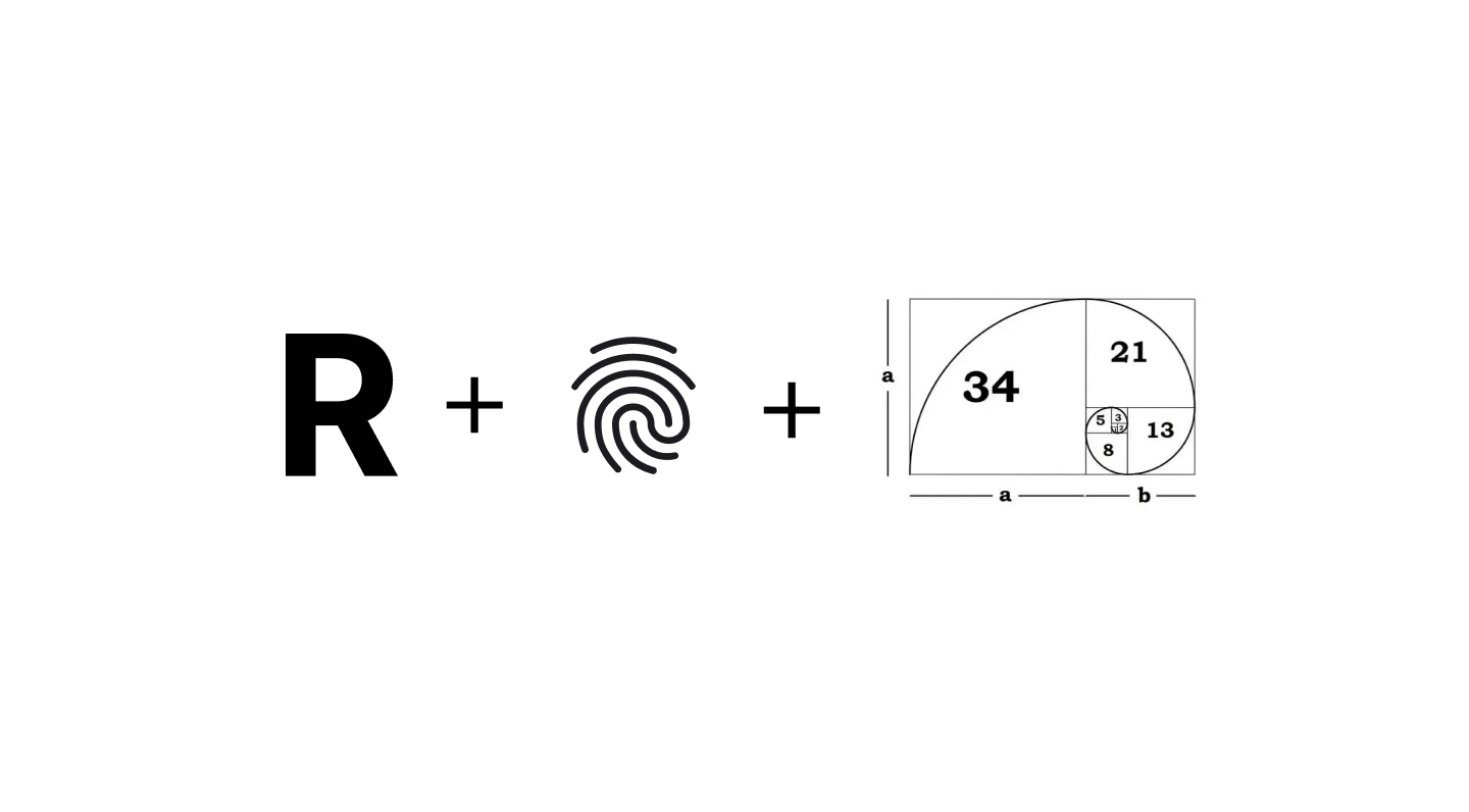
R + identity + golden ratio.
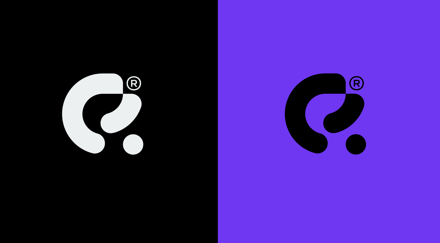
The symbol is born from the letter R, joined with the fingerprint — a sign of unique identity and security — and built on the golden ratio, bringing balance and harmony to its curves.
04 · Typography
Chillax
A rounded geometric sans-serif that echoes the symbol’s curves and keeps reading light and contemporary.
Aa
abcdefghijklmnopqrstuvwxyz
abcdefghijklmnopqrstuvwxyz
abcdefghijklmnopqrstuvwxyz
05 · Colors
Deep violet and technical neutrals.
Two violets carry the brand’s energy and innovation; graphite and light grey bring sobriety and credibility.
#6C0CB8
RGB 108 · 12 · 184
#1E252F
RGB 30 · 37 · 47
#6F37F2
RGB 111 · 55 · 242
#ECF0F1
RGB 236 · 240 · 241
06 · Applications
The brand in use.
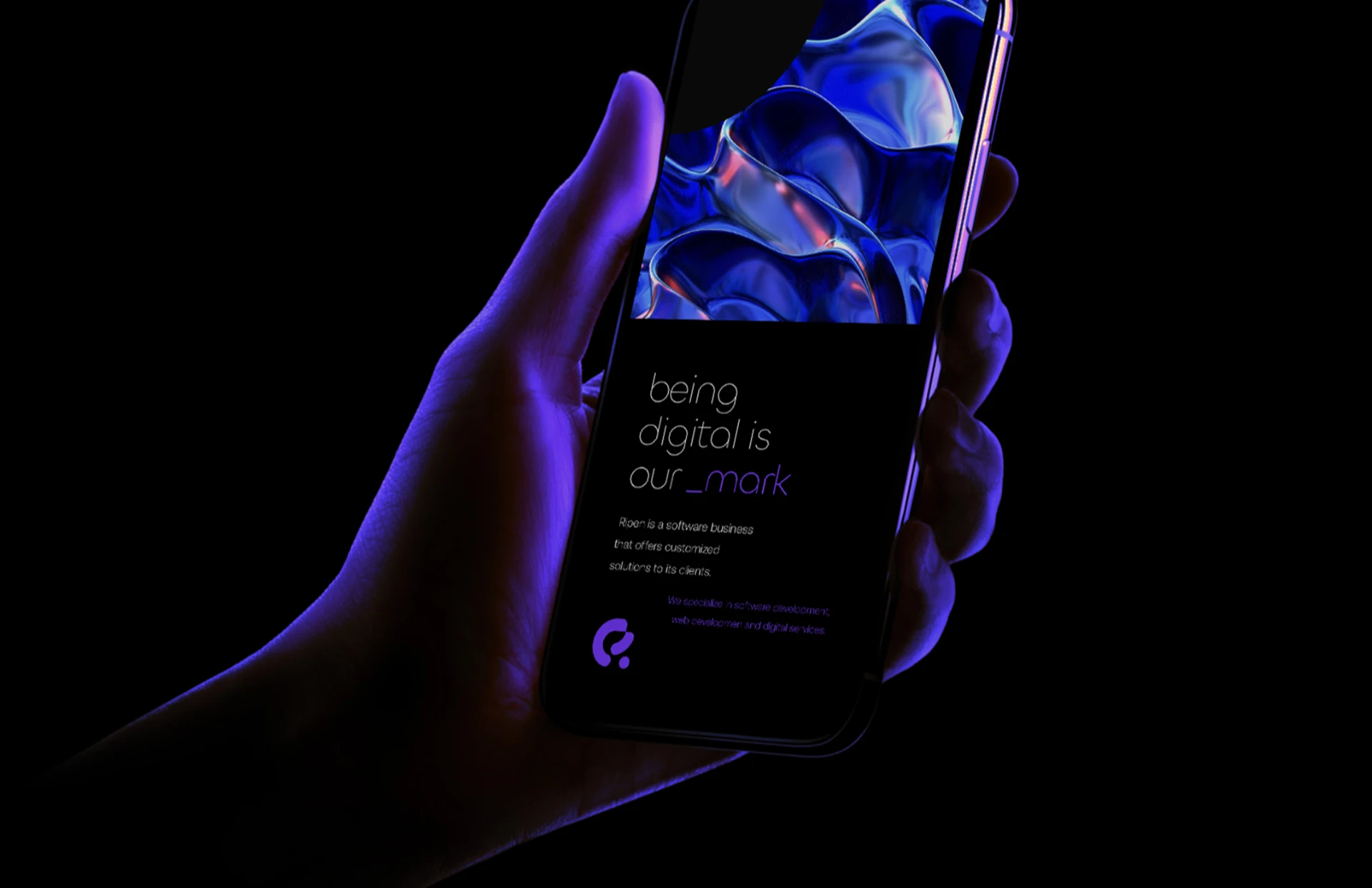
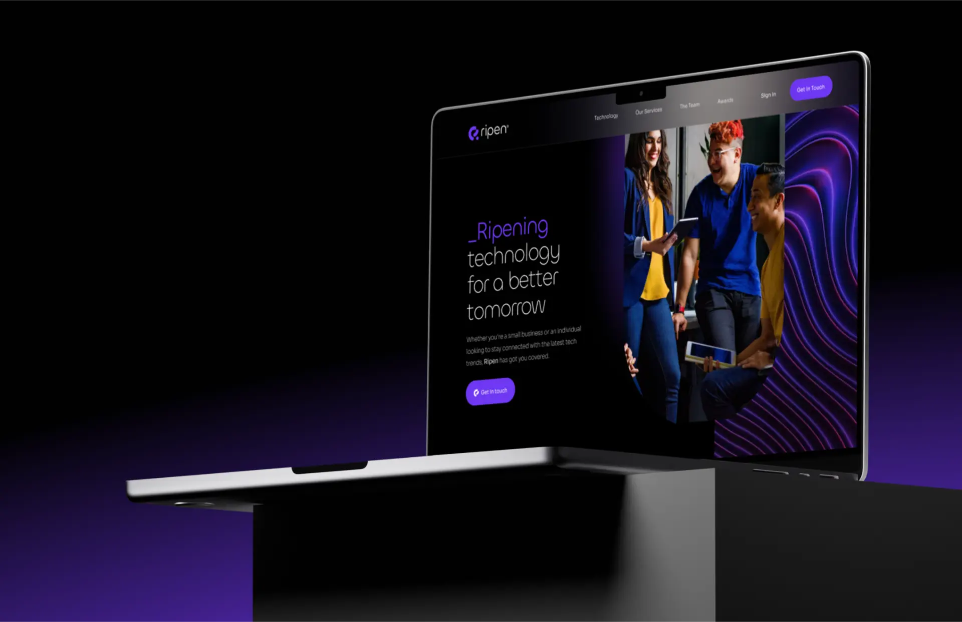
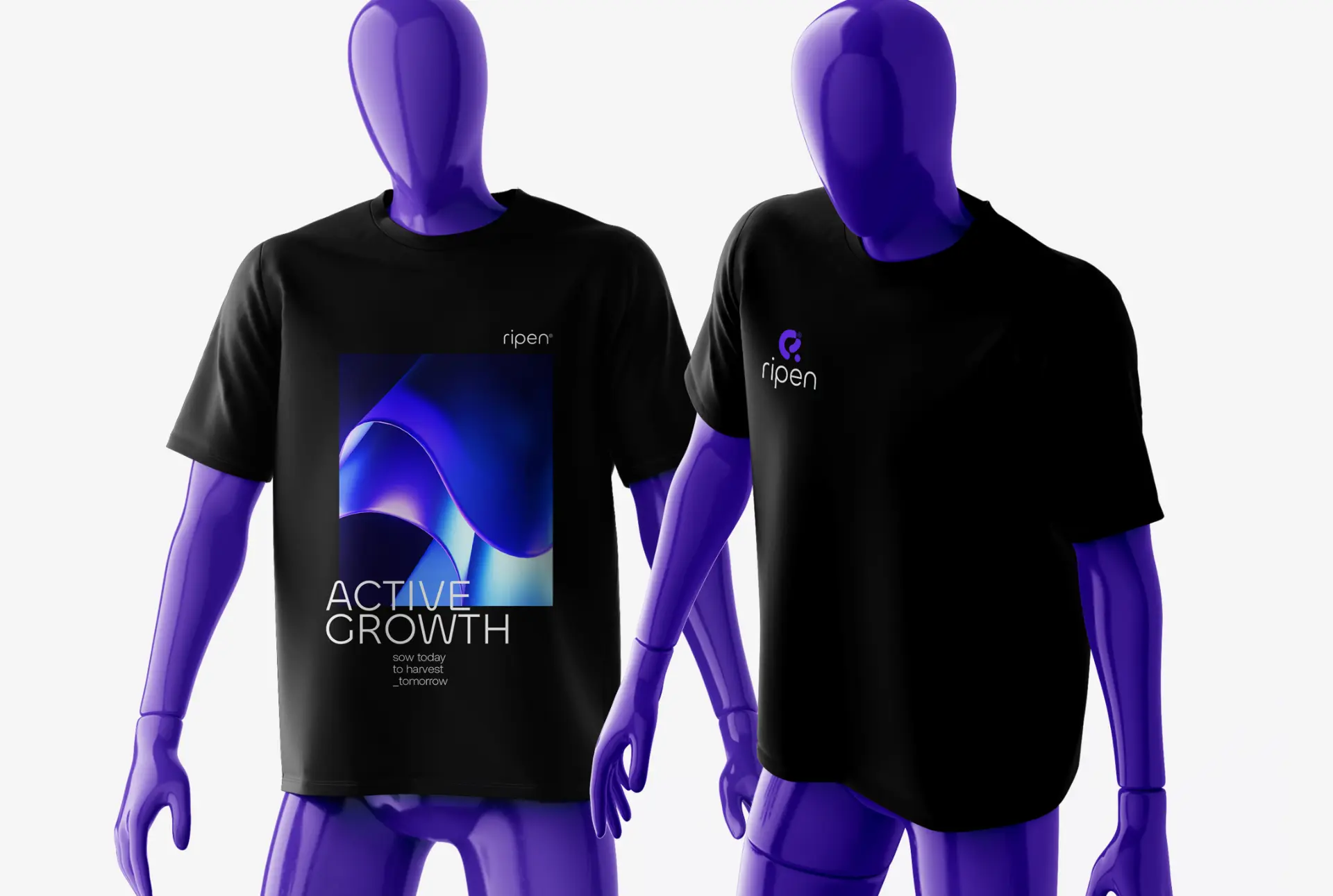
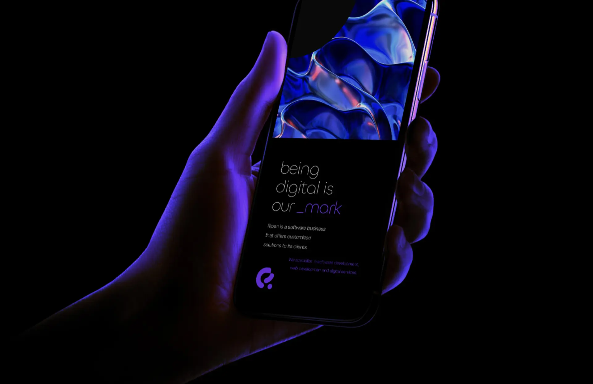
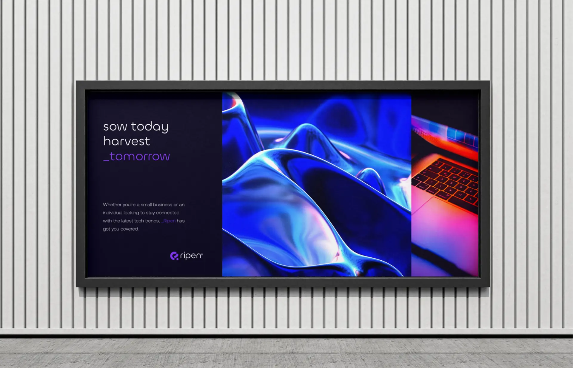
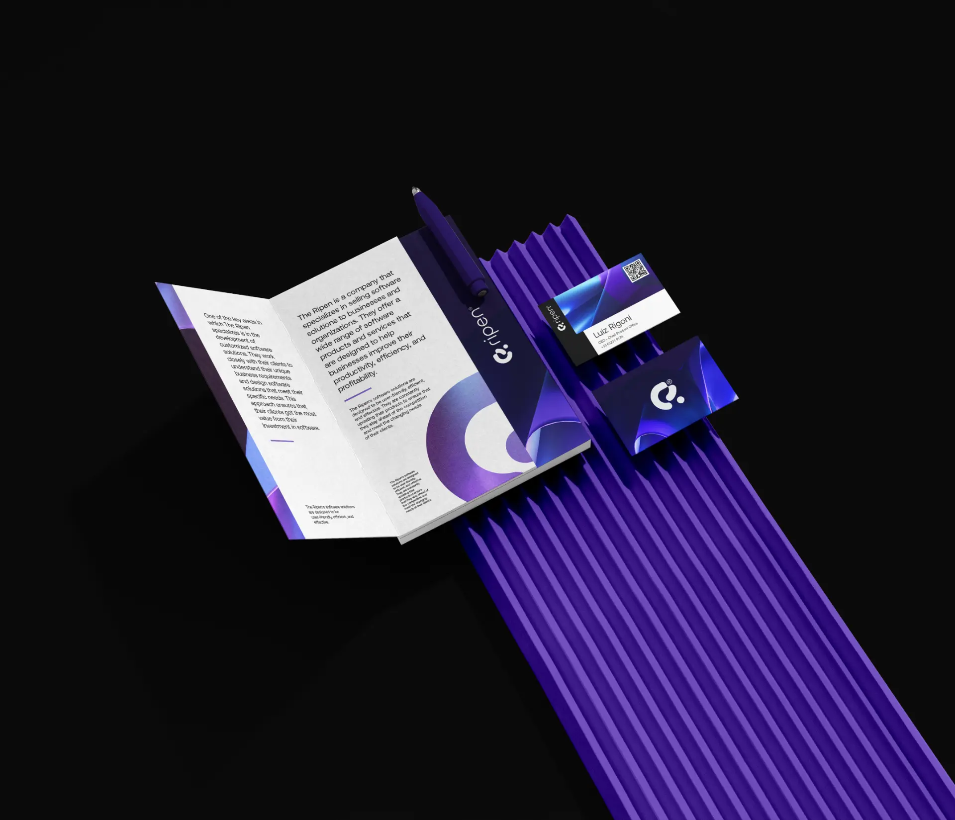
From the website — “Ripening technology for a better tomorrow” — to print and stationery, the identity stays consistent across every touchpoint.
Learn more
Note: the company’s website was not developed by me — this button leads to Ripen’s official page.
More projects