Sigraweb · Product design case study
Exploratory A/B Test
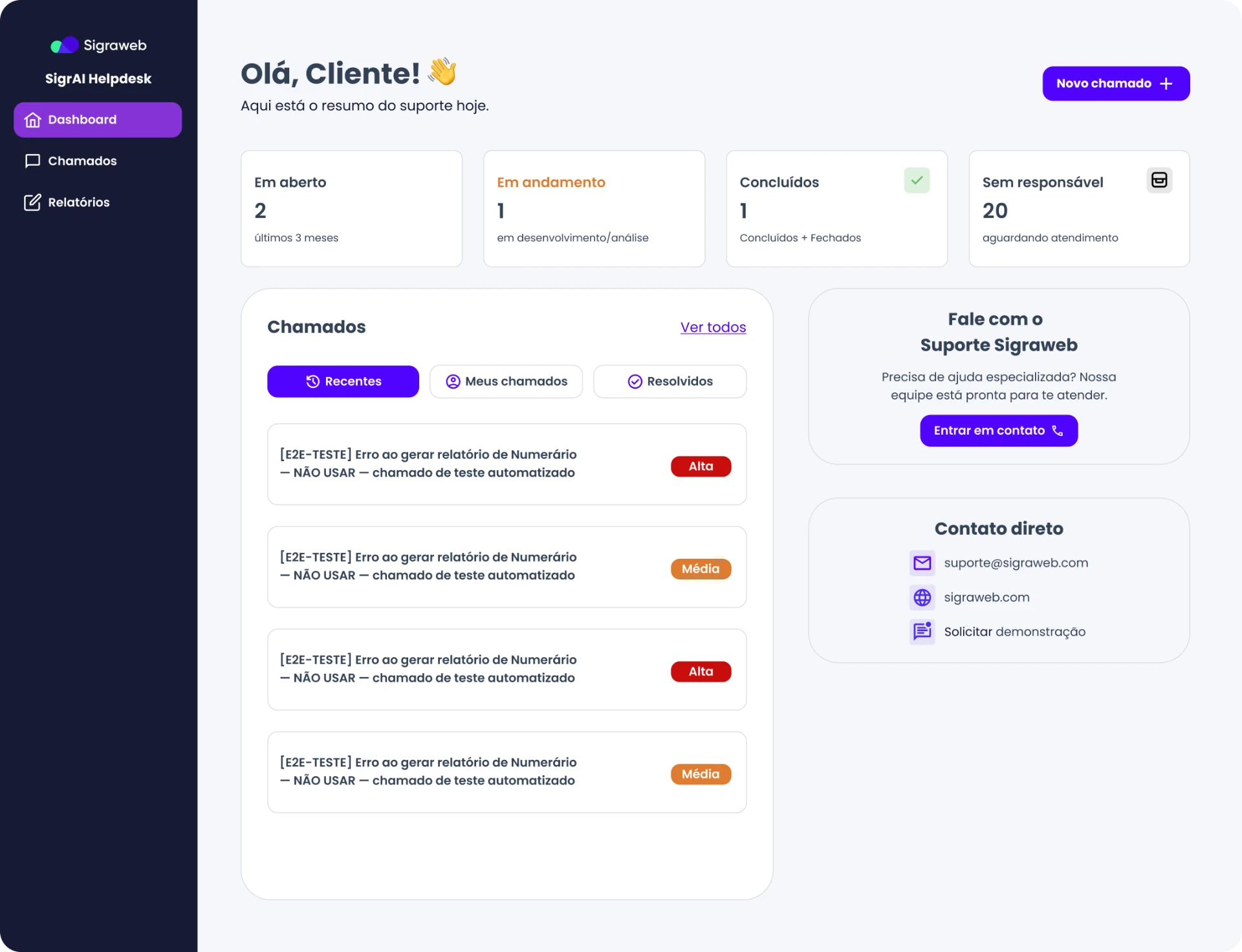
A qualitative test with internal users comparing variations of system screens to understand what improves visual clarity, comprehension of actions and information hierarchy.
- Method
- Exploratory A/B test (qualitative)
- Participants
- Internal system users
- Screens tested
- Process screen and Feed
- Rule
- Choose only one of the options shown
Results at a glance
Three comparisons, three decisions. Each row leads to the full test, with the screens and the users’ reasoning.
| Test | Variations | Majority preference | Perceived decision time |
|---|---|---|---|
| Action buttons | A with icon · B without icon | A | Intermediate |
| Progress bar | A with percentage · B without percentage | A | Shorter |
| Feed | A current version · B new People tab | B | Longer |
Goal and method
The variations were presented to internal system users in an evaluation setting, without specific tasks to complete. The focus was on visual clarity, understanding of actions and the perceived hierarchy of information.
Users we listened to
- Internal users
- Regular use of the system
- Moderate or high familiarity with operational processes
Questions
Eight open questions guided the conversation in each comparison.
- 01Looking at the screens as carefully as possible, what differences do you see between them?
- 02How do you feel when you see this screen?
- 03What caught your attention first?
- 04Which one feels more intuitive? Why?
- 05What do you feel is missing from this screen?
- 06What bothers or confuses you?
- 07What would you do first on this screen?
- 08Does this screen make you feel confident to take an action? Why?
Process screen
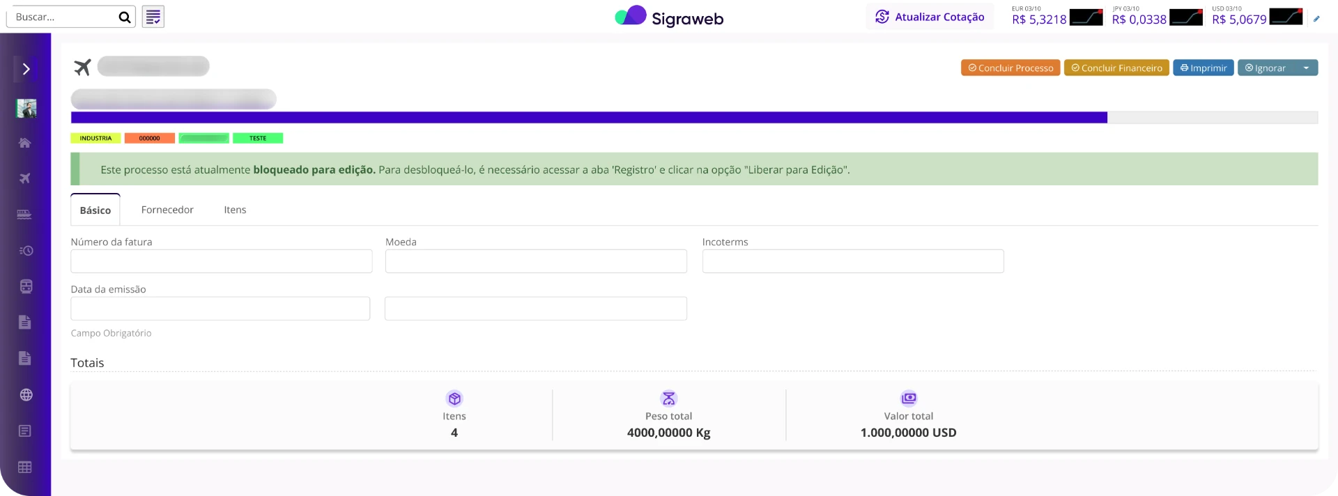
A test on process completion, screen dynamics and buttons. First the two full versions, then the changes and, finally, two isolated tests: buttons and progress bar.
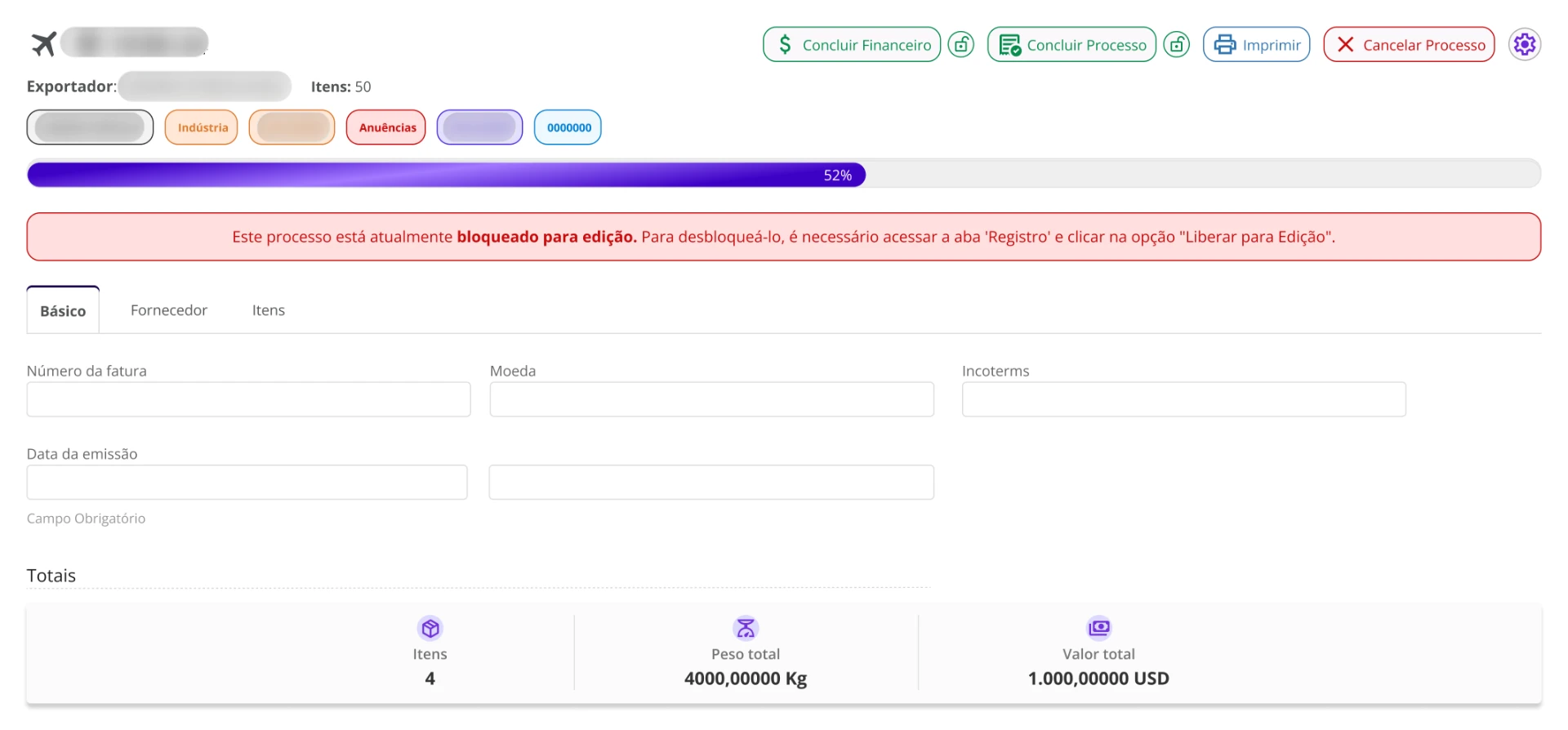
Changes made to this screen
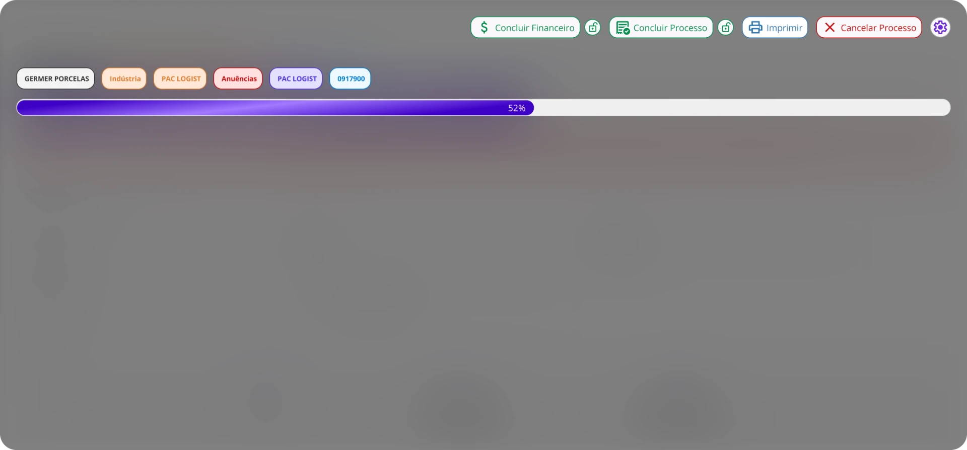
The changes focus on the process header: actions, tags and progress.
- Actions as outlined buttons with icons, with a lock next to “Complete Finance” and “Complete Process”.
- “Ignore” becomes “Cancel Process”, in red.
- Pill-shaped tags, coloured by category.
- Rounded progress bar with gradient and percentage.
- Edit-lock warning in red, and a header with exporter and total items.
Buttons: with or without icon
Which version of “Complete Finance” do users identify better?
Impressions and answers
Perceived decision time: intermediate.
Why?
- Users reported identifying the button faster: “I found the button faster thanks to the icon”.
- Visually more appealing (aesthetic preference).
Progress bar
Which bar better communicates the progress of the process?
Impressions and answers
Perceived decision time: shorter.
Why?
- Written percentage is a better way to read progress.
- Rounded corners feel more modern.
- The colour gradient added a sense of movement.
Feed
A new screen proposal, with a People tab replacing Birthdays and Phones. Users compared the current version (A) with the new proposal (B).
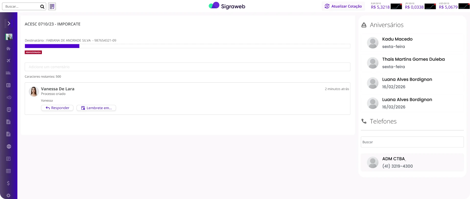
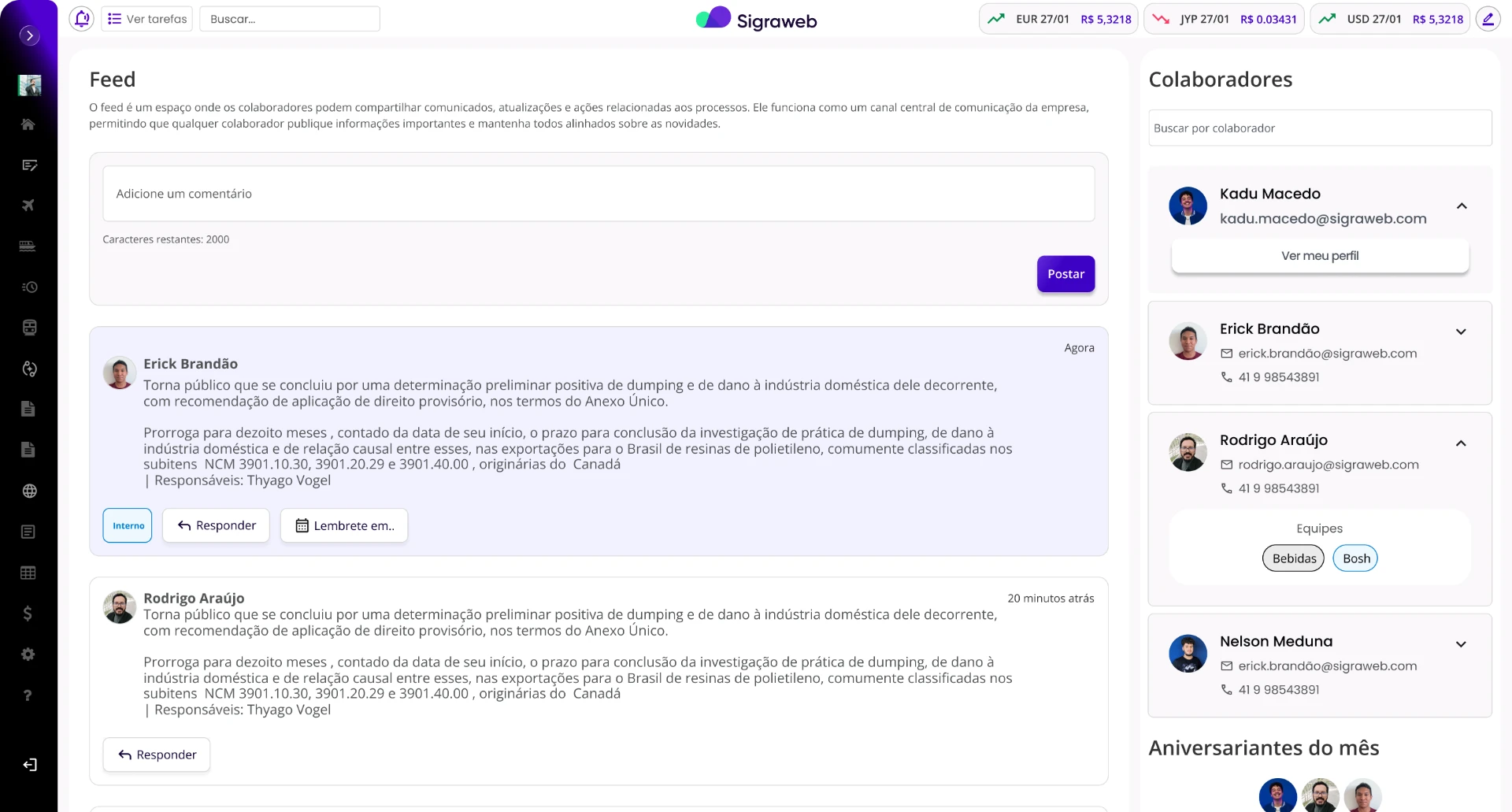
Changes made to this screen
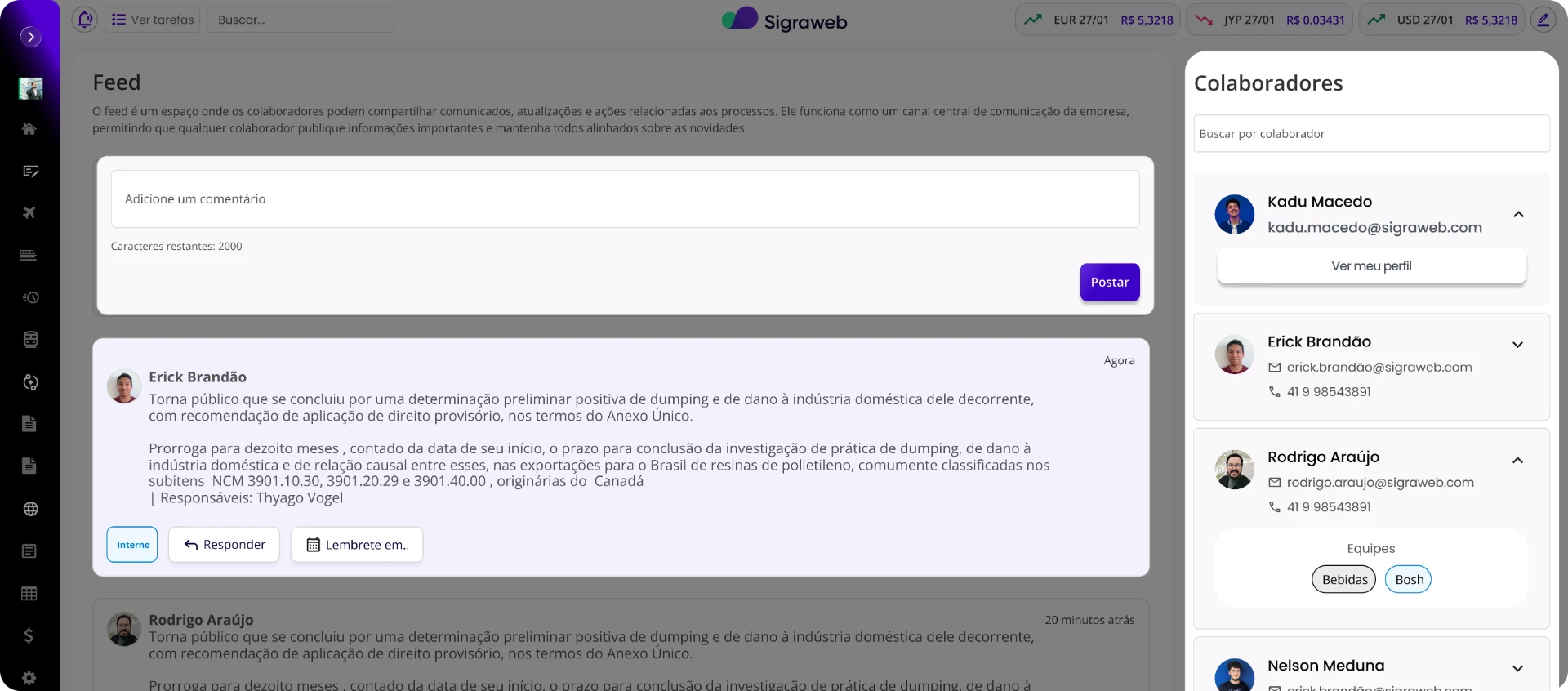
The feed gains its own hierarchy, and the side panel now shows who people are, not just when their birthday is.
- Highlighted posting area, with character counter and “Post” button.
- “People” panel with search, the user’s own card (“View my profile”) and expandable cards with e-mail, phone and teams.
- Posts with larger type, an “Internal” tag and “Reply” and “Remind me in..” actions.
- “Birthdays this month” moves to the bottom of the panel.
Impressions and answers
Perceived decision time: longer.
Points to improve
- The title and explanation are unnecessary inside the Feed.
- Add job titles to the People tab to make identification easier.
Why?
- Larger type improved visibility and readability across the feed and each card.
- The People area proved more useful than birthdays alone.
- Better hierarchy, with colours that make the creation area and posts clearer.
Learnings and validated hypotheses
Small decisions matter
In dense interfaces, small visual decisions directly affect the clarity of actions.
Decoration helps, but doesn’t decide
Decorative elements can help initial recognition, but don’t always support quick decision-making.
In the feed, hierarchy beats explanation
Hierarchy and typography had a bigger impact than textual explanations.
Thanks for reading this far!
And thanks to every user who answered the test honestly.
linkedin.com/in/kadumacedoMore projects